Interlogica
Improving the talent acquisition in a tech company
Year
2019-2020
Industry
Employer branding
MY CONTRIBUTION
RESEARCH DESIGN · FACILITATION · QUALITATIVE SYNTHESIS · UX/UI · EMPLOYEE EXPERIENCE
_01 brief
Interlogica is a company that deals with software development, IoT, and Big Data. It has around 60 employees, most of whom are developers.
Given the strong recruiting needs in the dev area, the Communication Team has drawn up an immediate activity plan in order to promote the corporate culture and attract new talent.
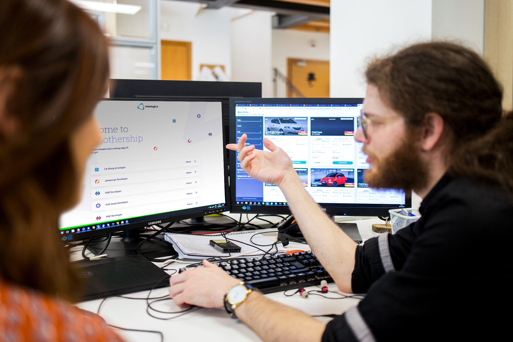
The Design Team, to which I belong, was involved to put in place a landing page that could convey these messages and display the open positions.
The challenge
Create a targeted landing to promote the authentic and distinctive aspects of the company and attract new talents.
_02 process
A good chance for a good process
An internal project like this is an excellent opportunity to make a positive contribution to one's colleagues, and it is therefore important to prepare everything with the right approach without immediately jumping to a too-hasty solution.
We created a roadmap that envisaged internal research, essential to define how to act and communicate efficiently.
The project was carried out by me and other UX designers of the Design Team, thus becoming for us an excellent opportunity for internal experimentation.
1.
ENVISIONING
Internal research with developers to empathize with the target
2.
define the authenticity
Synthesis of the envisioning to define the most authentic topics
3.
be inspired
Competitor analysis and moodboard definition of contents and styles
4.
create
Convergence and visual study of
the final solution
_03 Envisioning
Time to experiment with creativity!
Being an activity between colleagues, we didn't want to set up classic interviews. We, therefore, opted for short informal conversations of about 30 minutes, to understand more about them, empathize on topics relevant to their context, and the reasons why a company is attractive or not in their eyes.
Through brainstorming, we identified a few areas of interest to explore:
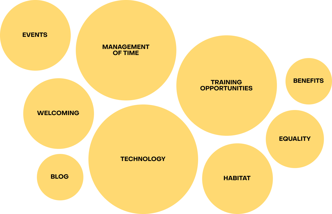
We then made the initiative public through company communication channels (Workplace, Scrum of Scrum, e-mail) reaching the interest of our colleagues: 17 developers have come forward!
To make the interviews informal, we have introduced a series of experiments. Before starting, to each participant was asked to draw something representing themselves on a post-it: taking a felt-tip pen in hand to sketch, breaking the ice, and expressing individual passions and interests!
After that, we started our exploration keeping it an open conversation, with one of us designers taking notes through a colorful mindmap. This way the participant could see the thoughts taking shape, in a completely transparent way. The mindmap has allowed us to avoid audio recordings and keep the atmosphere more relaxed.
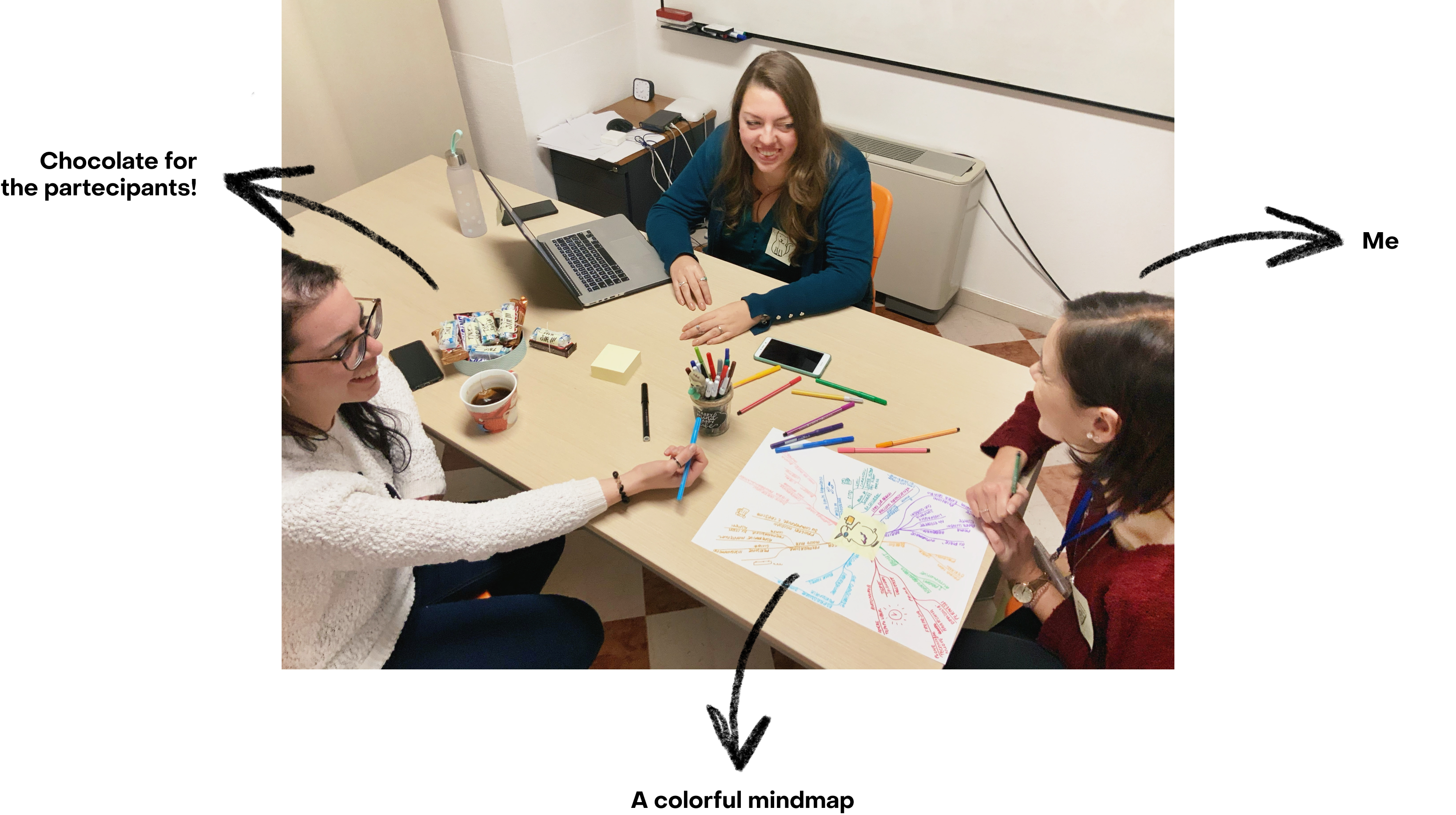
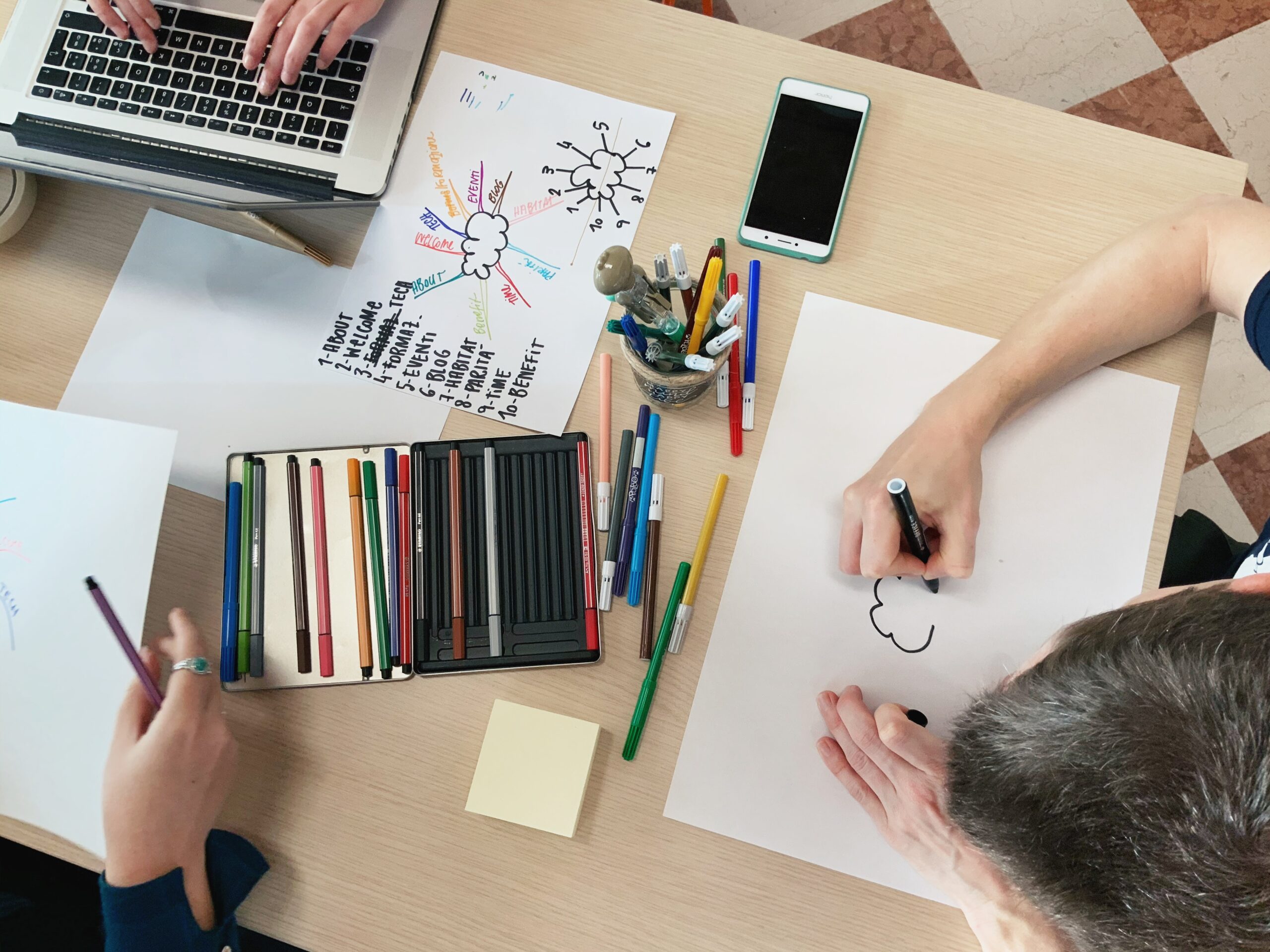
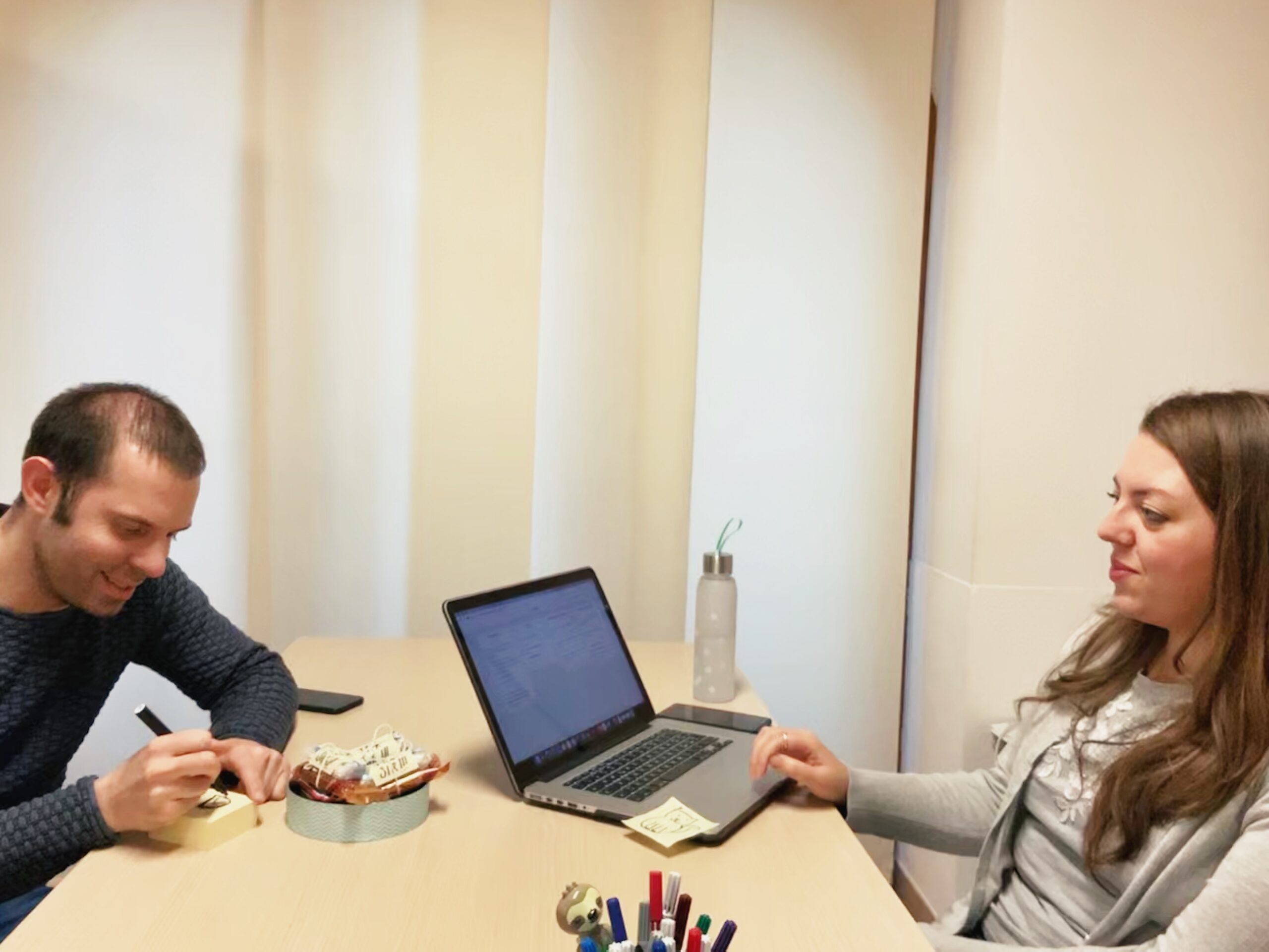
Some shots from the interviews
After each interview, the participant placed the post-it with the drawing in the center of the mindmap and gradually the sheets were hung on the wall to convey a sense of participation, as part of a puzzle.
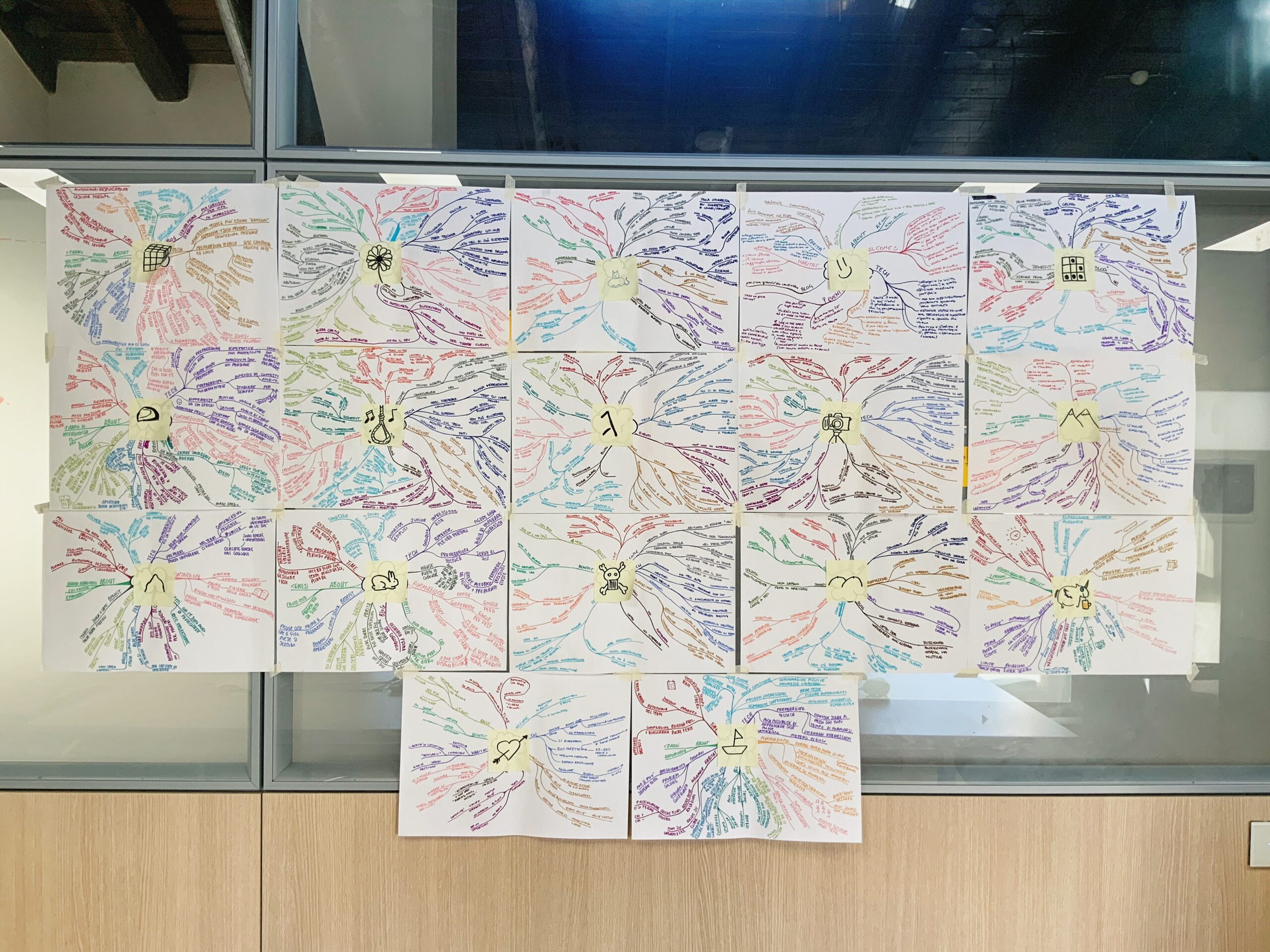
All the mindmaps together, how many colors!
_04 DEFINE the authenticity
Bringing out what's truly authentic
It is important that the landing does not fall into the classic stereotypes of devs and is instead open to all shades of personality and identity. It must be the contents, tangible and true, that convey the messages and not the appearance.
Mindmap in hand, we reviewed them one by one, collecting all the interesting insights for each of the thematic areas. As a convergence of the analysis, it was decided to focus communication on the strengths that have been confirmed as the most truthful and authentic.
The insights have also made it possible to define extra actions, which make it possible to improve some aspects of the general communication of Interlogica but above all the working quality of the devs themselves.
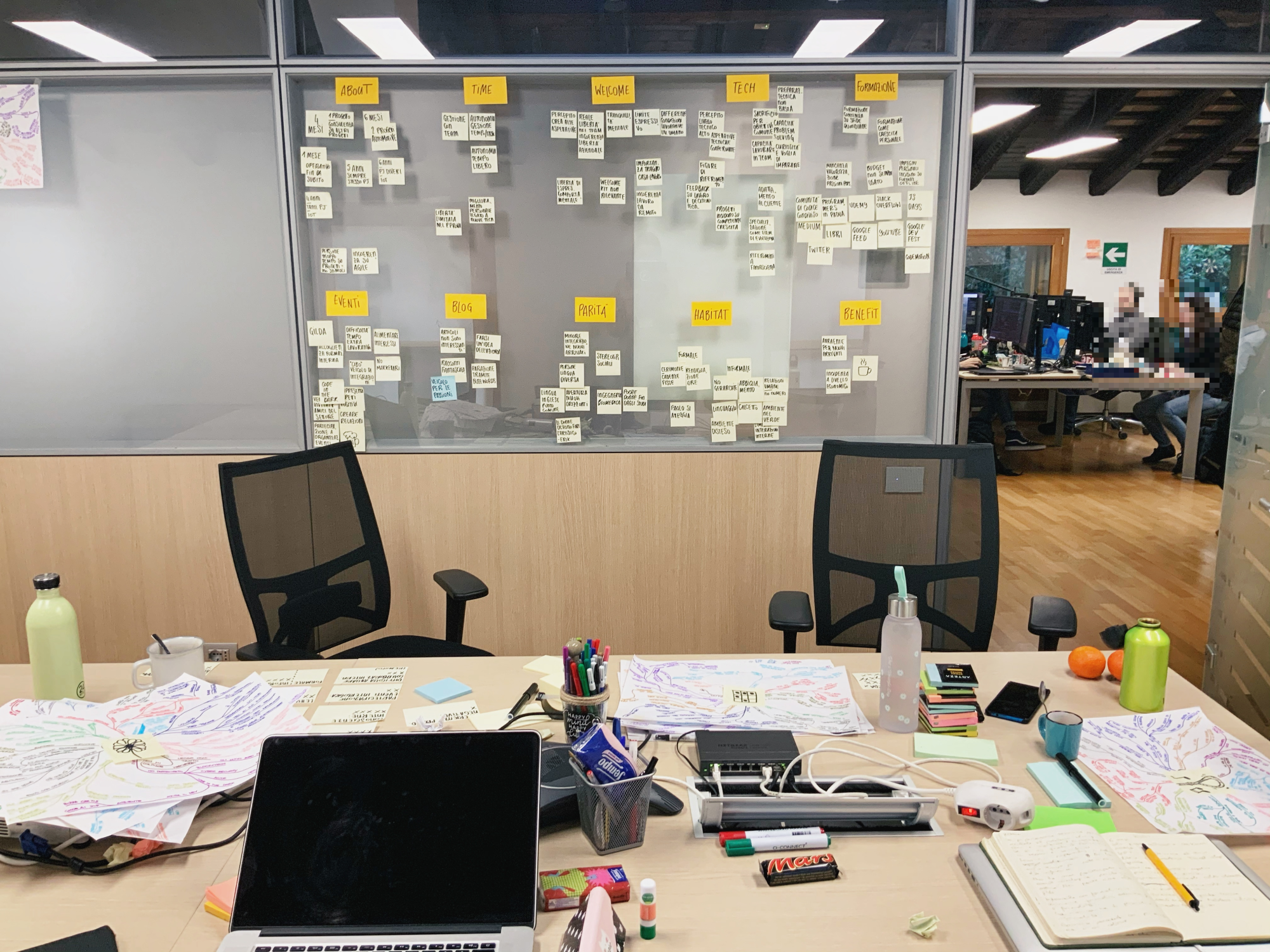
_05 Be inspired
Defining a personality without falling into stereotypes
Once the messages to be conveyed were defined, a careful benchmark was carried out to draw inspiration on 2 fronts:
 Content & tone of voice - Looking not only at companies that are direct competitors of Interlogica taken into consideration, but we also explored other realities that are technological excellences in the IoT and automotive sectors, event promoters, etc.
 Look & feel - More stylistic moodboards were explored, converging into 3 proposals. We have decided to proceed with the first one here below: bright, playful, and dynamic colors to create an environment that is as inclusive as possible and far from stereotypes (which are unfortunately too widespread!).
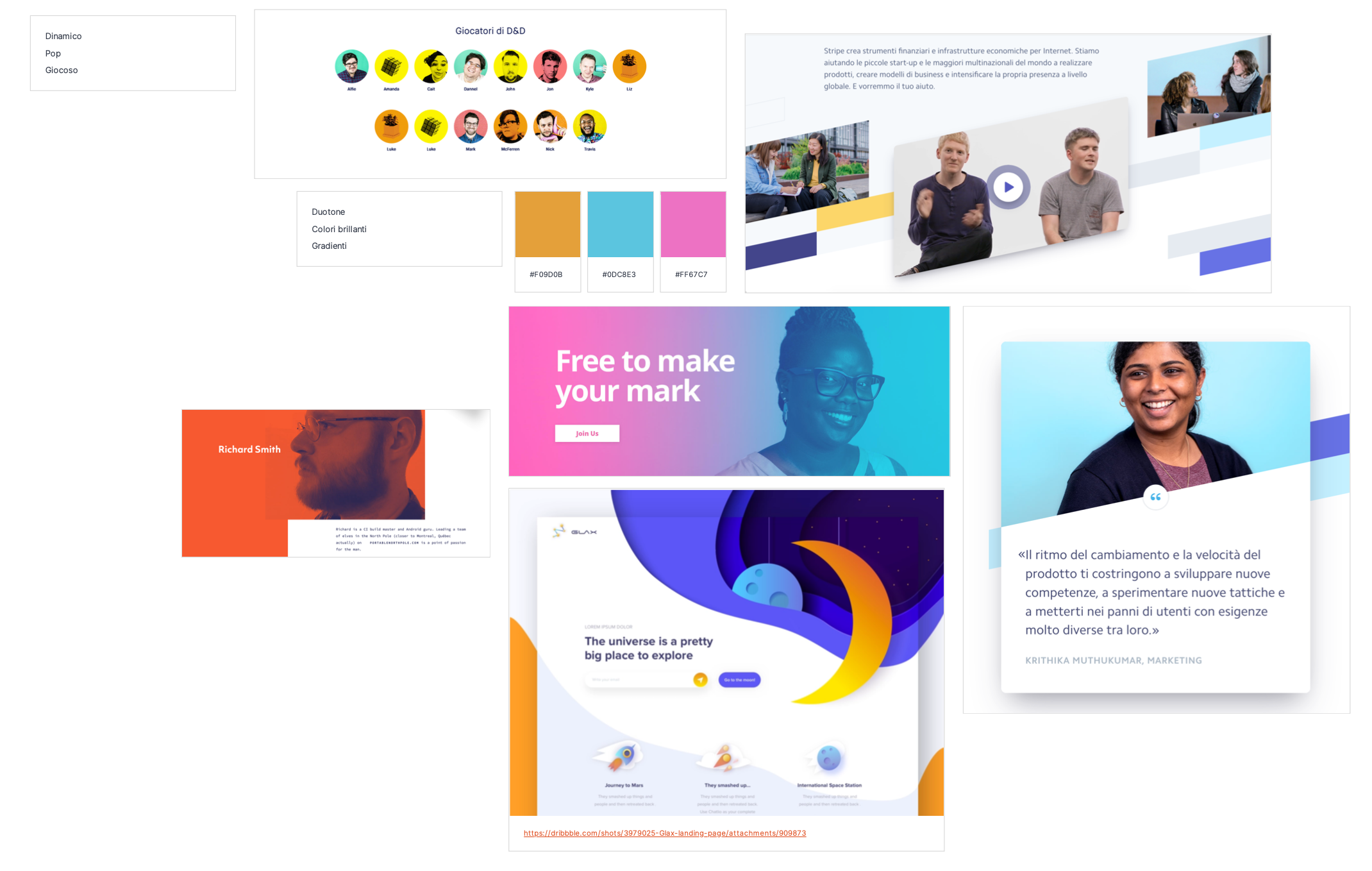
The chosen moodboard: bright, playful, and dynamic colors to communicate inclusivity, far away from the classic stereotypes of developers and tech
_05 Create
Create something meaningful
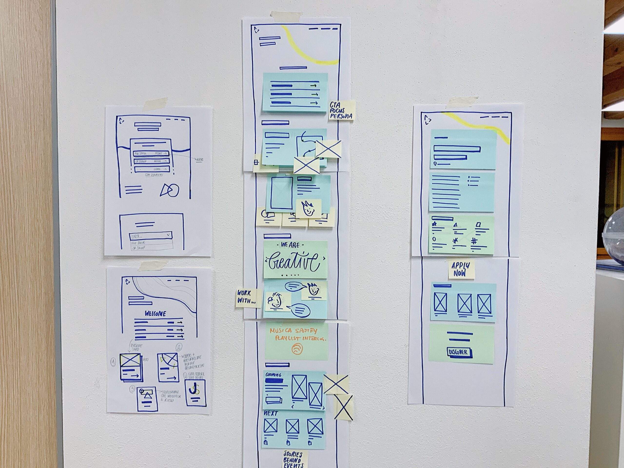
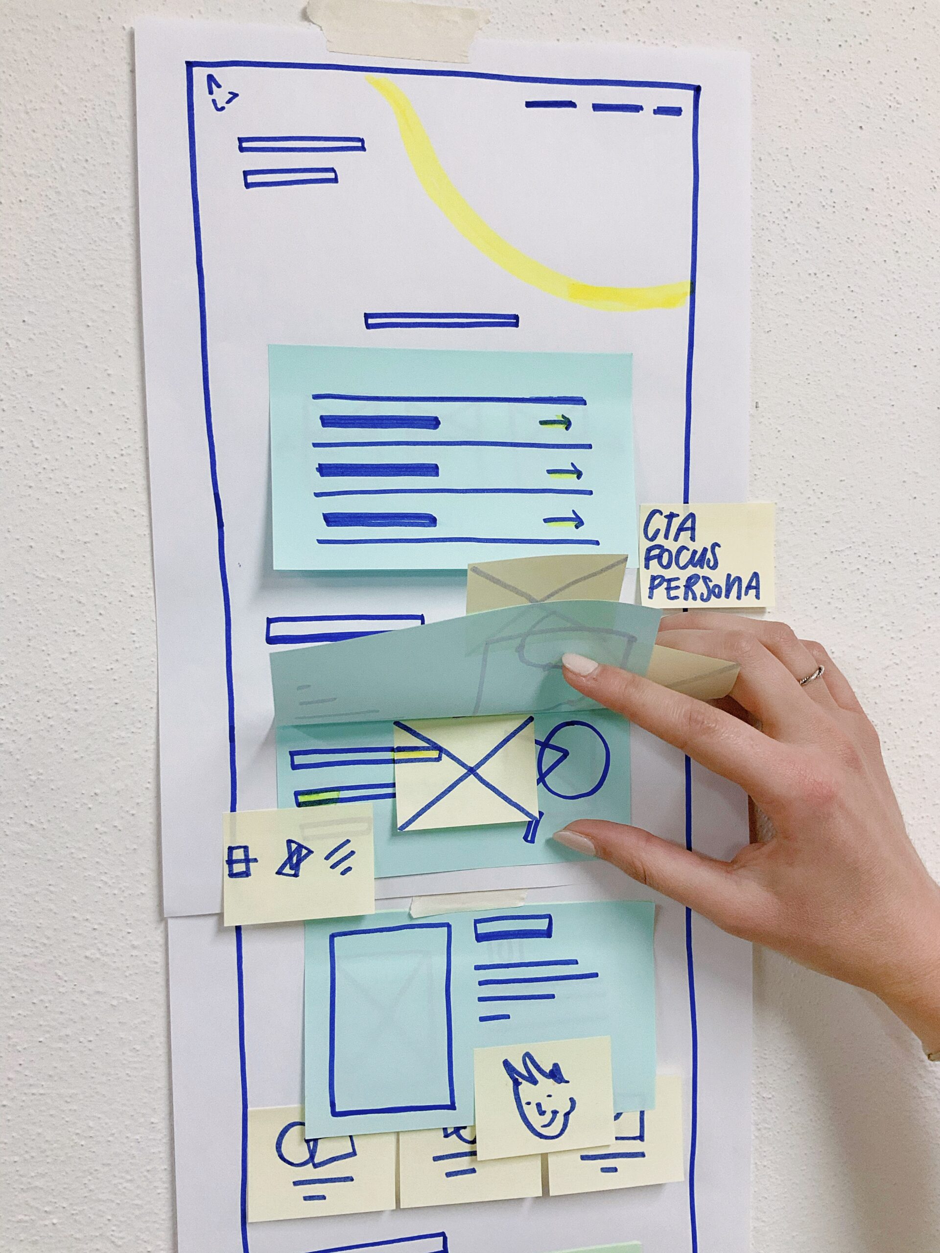
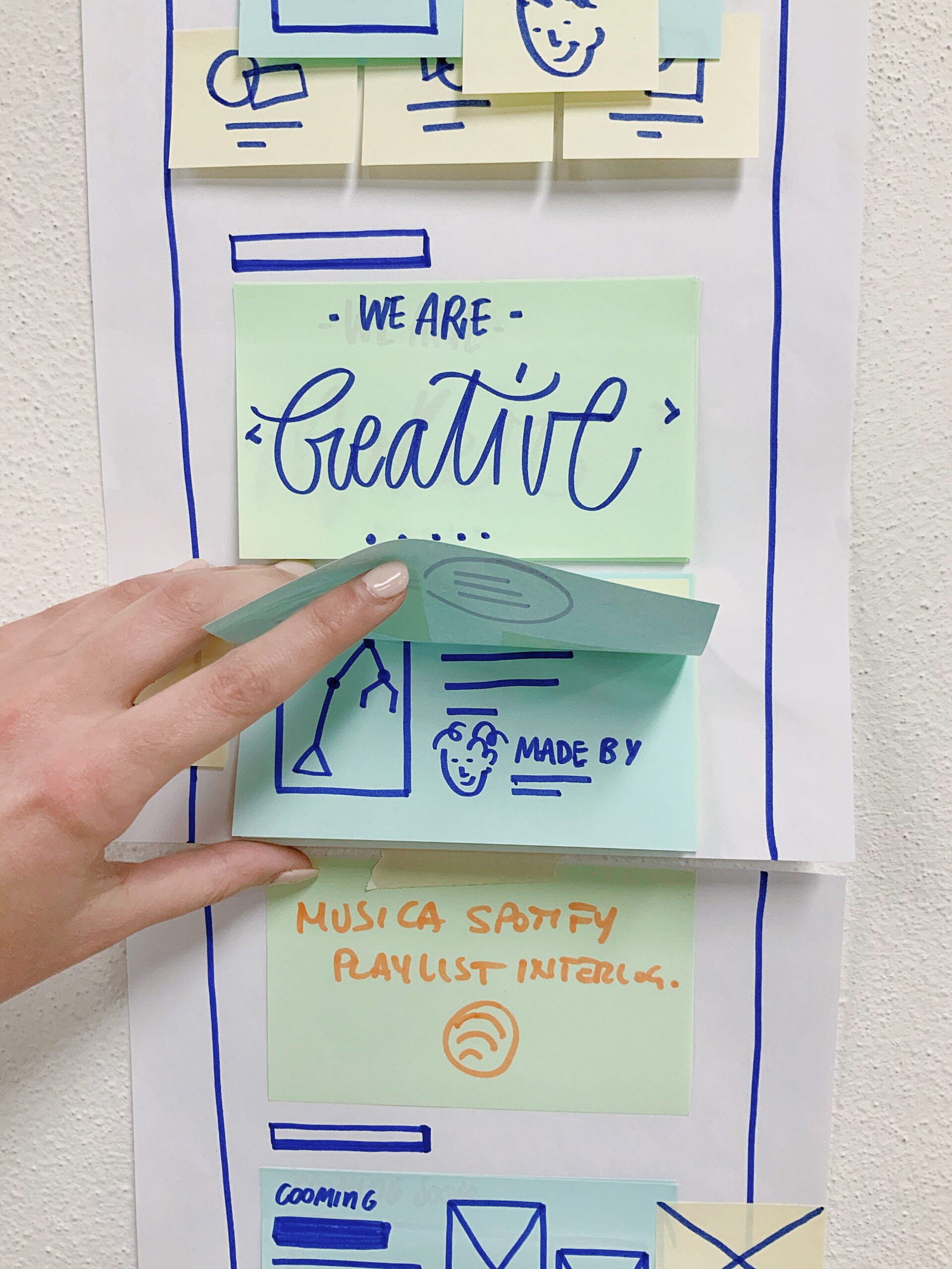
With our minds full of inspiration, we started thinking about how to convey the content on our landing page and the application detail page.
We have focused on quantity rather than quality to freely explore as many ideas as possible, superimposing sketches and post-its to be able to group them, and reshuffling the order based on the priority of the content. The exercise was helpful to be able to materialize a draft before moving on to the visual part.
Throw in a pinch of animation...
Programming languages use special characters and symbols; normally, a developer is not satisfied with the minimum pushing the technological capabilities far beyond the limits.
This is why we wanted to create a series of animated symbols, which represent the various roles of developers and industries of interest and enrich the landing site's personality.
...mix all together and the dish is served!
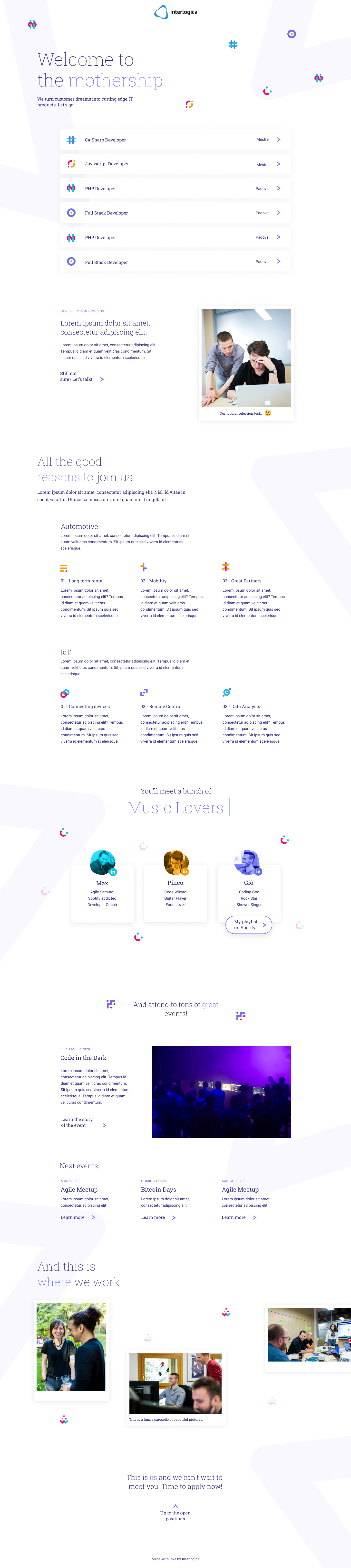
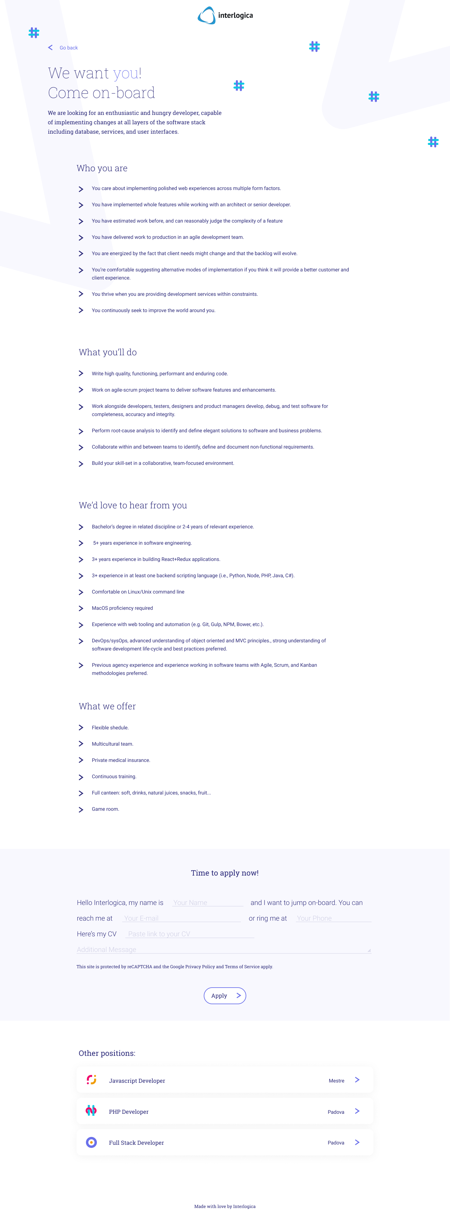
The animated symbols are a detail that is added to the final creation of the pages that make up this mini-website:
- The landing with the full list if open positions, with the main focus to attract new talents and communicate the authentic values of Interlogica;
- The detailed page with the description of the open position, with attention on the high point of interest for a developer
 Credit goes to my colleague Chiara Giuliani for the creation of the animated symbols and the whole visual design!
_06 Conclusion
Building bridges: the most beautiful lesson
Finally, the landing page went into development, and in a short time, it was published online. In that period I left Interlogica to start a new work experience in another company, Design Group Italia, so I was unable to introduce KPIs and collect data on the results brought about by this work.
However, I am very proud of this case, because the envisioning phase and the experimentation that we were able to implement involved me a lot. We could not predict whether the idea of mindmaps would be a flop or not, whether the insights would be effective or just an unsuccessful waste of time. But instead, it turned out to be a beautiful experience, which allowed us to get more in touch with our travel companions and open new communication bridges with them!